
I was inspired by my colleague Neal Levin’s recent blog posts where he combined his passion for data and insights with interests in other areas. I’m passionate about government transparency so I wanted to see if I could build a dashboard that would shed some light on the City of Chicago’s Freedom of Information Act (FOIA) requests using Power BI.
This blog walks through how I built my solution. I plan to do a follow up post on the insights.
Background
The key to FOIA requests is you need to know what you’re looking for before you request it. That’s why FOIA logs are incredibly important: they tell you who requested what and when. They’re accessible to provide ideas as to what you may want to look for. I saw building a dashboard as being important because I thought providing a single location with a large city’s FOIA requests could inspire individuals to submit their own FOIA request.
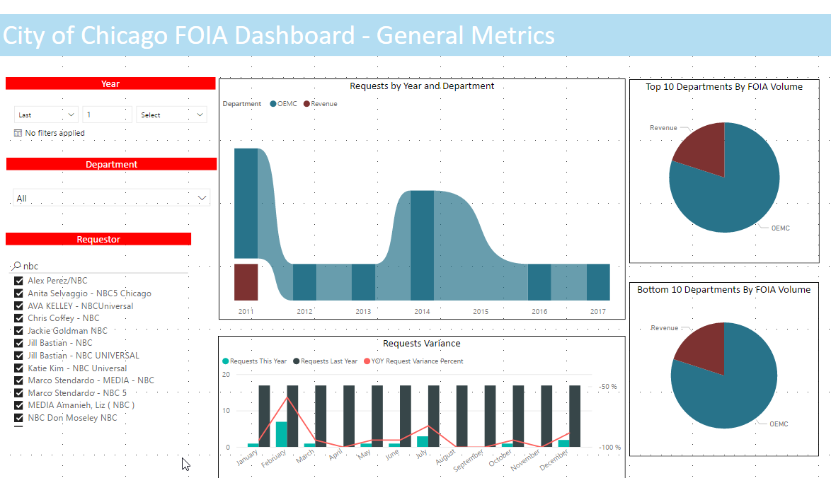
Here’s what the finished product looks like. I recommend expanding to a full screen for the best experience.
[iframe width=”800″ height=”400″ src=”https://app.powerbi.com/view?r=eyJrIjoiYjQwY2UzM2YtMzdlMC00YWJiLTk3MmQtMTk2ZDIwNjJiNGJmIiwidCI6IjVmYmJjZTJhLWMzZTYtNGI1ZS1hNTFmLTIyMjY3NGZkYjQ0ZCIsImMiOjN9&pageName=ReportSection712057585950e099a1b8″ frameborder=”0″ allowFullScreen=”true”]
Can’t see it? Click here.
Solution
Like I said last paragraph, FOIA requires you to know what you want. The same tenant applies to building reports in Power BI: you need know where you’re getting the data from. Thankfully, Chicago provides a wealth of data at https://data.cityofchicago.org. Even if you don’t live in the Chicagoland area, I recommend checking out the site as there’s a lot of information out there.
From the, search for a particular data source – in this case FOIA. All feeds can be accessed via a JSON API.
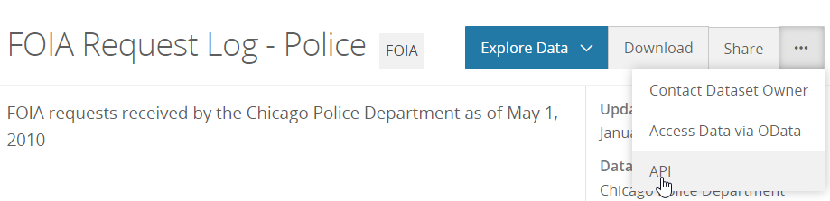
It’s incredibly easy in Power BI to add JSON. One thing I ran into late in my development was I was not returning all of the rows of data in the API. This obviously makes sense from a performance standpoint. So when you add a JSON data source from the city’s portal, be sure to append the endpoint appropriately with however many items you want to retrieve: ?$limit=3000.
Once I added all the APIs, I knew I’d have to combine all of the data sources into a single table. A single table would require identical columns, so I had to edit the data model so the columns were identically named across every table. I tweaked a couple columns as necessary, and since there wasn’t a header in the JSON API, I added a column to specify the department for each table.
When that was done, I created a union table called “All Requests” to combine all of the FOIA requests. I originally had this formula:
All Requests = UNION(‘311’, ‘Animal Care and Control’……)
Even though all of my tables were normalized, Power BI really didn’t like my union query on a couple of the tables. What was happening is some columns from some tables were in the wrong place in the union table and that broke everything.
I then tried this approach. I’ve indented it to make it more legible.
All Requests =
Distinct (
Union(
SUMMARIZE(
‘311’, ‘311’[date_received], ‘311’[Department], ‘311’[description_of_request], ‘311’[due_date], ‘311’[organization], ‘311’[requestor_name]),
SUMMARIZE(
‘Administrative Hearings’, ‘Administrative Hearings'[date_received], ‘Administrative Hearings'[Department], ‘Administrative Hearings'[description_of_request], ‘Administrative Hearings'[due_date], ‘Administrative Hearings'[organization], ‘Administrative Hearings'[requestor_name]),……)
This is obviously different, but in a good way. Let me explain what this does.
Summarize provides a distinct value from each table. Union grabs all of the tables. And lastly distinct provides individual values.
With my All Requests table working how I wanted it, I now had to create a fact table on Department. A fact table allows me to slice using a particular field; in this case department.
I created the department fact table using the following formula:
Department = FILTER(DISTINCT(SUMMARIZE(‘All Requests’, ‘All Requests'[Department])), ‘All Requests'[Department] <> BLANK())
I also created a fact table for organization.
To show change year over year, I needed a date table. This too was done via a calculated table. Once that was done, I made relationships between Date and All Requests, as well as All Requests and Departments and Organizations respectively.
After that it was really just a matter of building out the measures I wanted and styling.
Cool Stuff
There’s a couple cool things in these reports that I want to highlight.
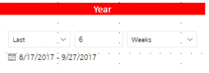
First, I used Power BI’s relative slicer in a few places. This easily allows you to show items in a particular range. For example, the last 6 weeks. It’s only been around a few months, so I was happy to implement it.
This dashboard contains my first Drillthrough report. Released only a couple weeks ago, I’ve been salivating at the chance to use this. I wanted a report where users could easily access data and a spot where I could have easily reusable visuals.
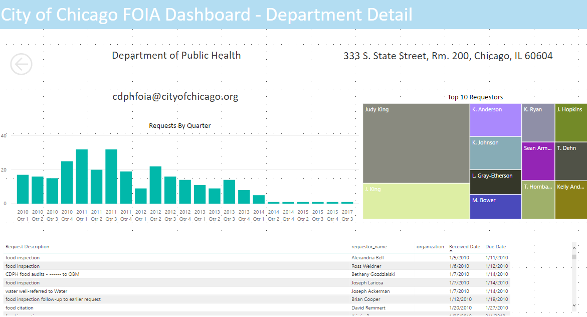
I’m pretty pleased with how it turned out, and look forward to enhancing it going forward.
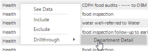
To get there, from the All Requests page, right-click a department in the table and select Drillthrough > Department Detail.
Lastly, I think it’s neat that you can see who requested what from which department. For example, I can search for a certain individual(s) and when they filed their request and with whom. There’s probably some really interesting trends out there that I look forward to exploring further.
Lessons Learned
The big takeaway from this project is that even though all the APIs originate from the same site, all of the APIs are different beasts.
I excluded several historical FOIA request logs due to departments merging (i.e. Cultural Affairs, Special Events, Fleet Management etc.,) but these can be added easily.
Looking through a unified table of all the requests, it become apparent that there are a lot of data entry errors. For example, the year 0215 appears several times and apparently several FOIA requests have been submitted in the future. At the time of writing, the most recent request is from the year 2019.
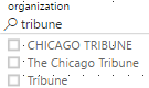
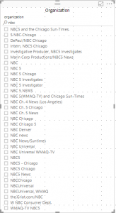
Another problem is that the data validation is poor, but in a way that’s expected. This is most apparent when searching for news organizations. The Chicago Tribune appears several ways, while NBC returns many variations of the same or similar organization. There are a lot of NBC 5s out there, but I have a feeling most of these are for WMAQ in Chicago.
It’s not just organizations: requestors suffer from a similar problem. The quandary I face when building a dashboard like this is I don’t know if E Abderhalden and Erik Abderhalden are the same person, and I would like to abstain from making a judgement call like that because I don’t know.
But what I would like to see is more and better consistency from the city and its departments in regards to how FOIA data is captured and processed – especially because most of the departments use the same generic FOIA request form.
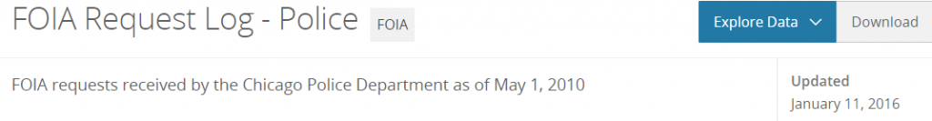
I think the biggest disappointment is that although some APIs says they were updated recently, the data is stale. The Chicago Police Department’s FOIA log was updated on January 2016, but the latest record is from 2013.
While FOIA logs can still be requested from CPD and other departments, by being so tardy in updating their data, it almost defeats the purpose of publishing the FOIA logs online. It’s additionally frustating considering that CPD has another other API which is very current.
What’s Next
I’m pretty pleased with this first version of the City of Chicago FOIA dashboard. However, I’d like to go further. First, I’d like more recent data across all departments. That will require some sleuthing and cajoling. I need to find who owns the data sources and figure out why they have not been updated.
Second, I want more to add more insights into the dashboard. Year over year metrics are easy, but I want to find and identify FOIA trends across the city and at the department level too. All of this is possible, but I’m also a little worried that with the wildly inconsistent data entries, this is going to take a lot of time. I have to give more thought about how to exactly I want to accomplish that, but I believe this dashboard is a step in the right direction. I hope you enjoy it.